May 02, 2025
BeaconMedaes Australia and Medclair Announce Strategic Partnership
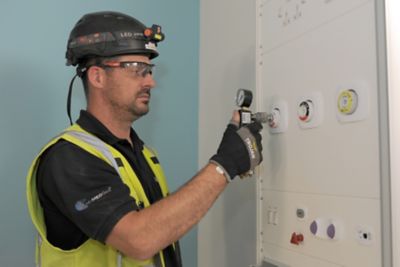
BeaconMedaes Australia, a leading provider of medical gas solutions, and Medclair, a Swedish innovator in sustainable nitrous oxide management, partner to transform the healthcare industry in Australia.


")
